RE: Techmeme Redesign
Throughout the day, I find myself on my iPhone, MacBook Air or on whatever device with the first instinct to pull up Techmeme. It has become my go to for tech news replacing almost everything else in the last year helping me navigate the junk around the web. Today, they launch a redesign of their website and I'll be up front. The margin for the main body stinks. It's no longer my home page and I refuse to visit it now on my laptop's browser. Count me in as a mobile reader only. This is their new design.

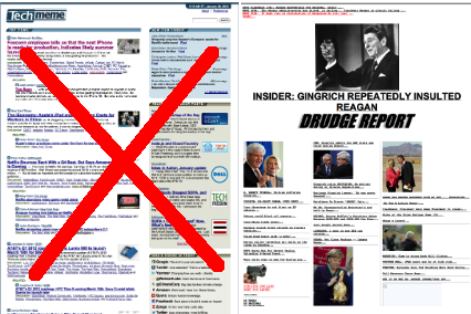
This is the old design layout where they compare it side by side with Drudge Report but if you take a look, there is far more room for the headlines rather than the "sponsored posts." Also, if you take a look at Mediagazer (their sister site), they have yet to implement the new look. Which design do you prefer?